
Today, I had a consultation session with one of my clients using Infusionsoft and their biggest frustration is their non-mobile-ready shopping cart. They sell online content and mp3’s and around 40% to 50% of their customers visit their website using smartphone or tablet device.
Unfortunately, Infusionsoft’s available shopping cart themes are not responsive (or mobile-ready) and making their shopping cart mobile ready would require you to hire a very proficient programmer (and probably expensive) to turn their shopping cart themes to mobile-ready themes. And also Infusionsoft have a very limited themes to choose from which is not good because there’s a high chance that the themes may not suit your company branding.
And why this is very important? An article from Fast Company tells us that mobile and tablet users spends more money than desktop users. It also shows that a high percentage of your site visitors are using mobile and tablet devices. So if your shopping-cart is not mobile ready, you are losing visitors, and therefore losing money.
So in this post, I would like to share to you an easy option to turn your shopping cart into a mobile-ready cart while preserving your company branding. But first, how do we check if your shopping cart is not yet mobile-ready?
How to check if your shop is already mobile-ready or not?
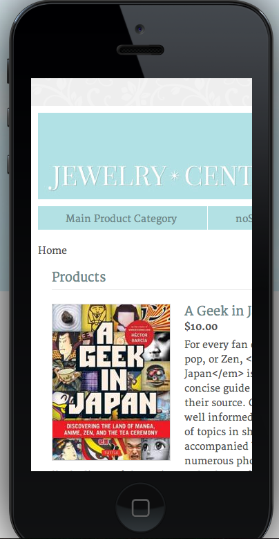
To check if your site is mobile-ready, we use an online tool called mobiletest: http://mobiletest.me/. Select a device and paste your shopping cart link to check how your shopping cart looks like in that particular device.
This is what it looks like when I tested one of Infusionsoft’s shopping cart themes (not mobile-ready):
Switch now to mobile-ready shopping cart
Infusionsoft’s shopping cart has so many limitation as you can see. Themes are not mobile-friendly, there’s few themes to choose from and you don’t have much control to the shopping cart interface.
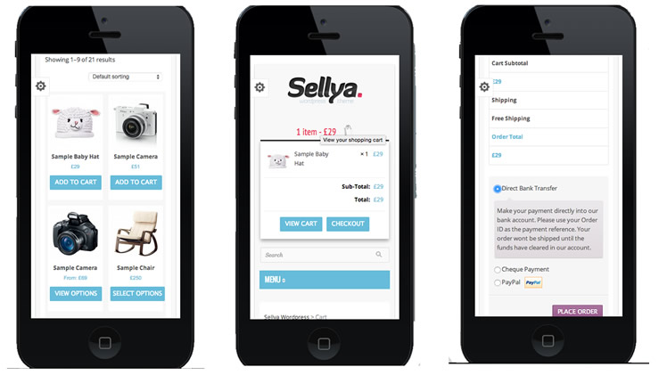
So instead of using Infusionsoft’s shopping cart, we use another shopping cart platform that will solve all the problem. And this platform is Woocommerce. With woocommerce, you have access to thousand available themes to match your branding and many of these themes are responsive.
For example, one theme called “Sellya” is a mobile-friendly theme in woocommerce below shows how it looks like when tested in iphone 5 (Products Page, Cart, Checkout).
To search for wooocommerce mobile-friendly theme. Just go to woothemes.com and find a theme that is “responsive”: http://www.woothemes.com/product-category/themes/responsive/ .
Alternatively, you can also go to another site: http://themeforest.com and find theme with keyword “Responsive Woocommerce” and it will list all woocommerce themes that is mobile-friendly.
For more information about woocommerce, go to http://woocommerce.com
But how do I connect Woocommerce to Infusionsoft?
Once you have setup your mobile-friendly woocommerce shop, how do we connect your shop to infusionsoft so you can still do all automation you needed?
And that’s why we created a plugin for this: InfusedWoo: http://woo.infusedaddons.com/. Using InfusedWoo plugin, you can create beautiful woocommerce site and still integrate with infusionsoft.